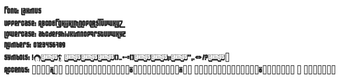
Techno display font with bold geometric glyphs
Lakmus, by Fenotype, is a techno-style display typeface meant for high-impact visual communication such as headlines and logos. It offers chunky, geometric letterforms with clean, uniform stroke weights and a groovy, industrial aesthetic tailored to display work rather than body text. The design targets graphic designers and brand artists who prioritize a distinct headline voice over broad typographic variety in multi-language projects.
What historical footprint and community usage does Lakmus have?
Originally released in the early 2000s, Lakmus has a longstanding presence among display fonts and shows measurable community uptake, with reported download figures exceeding 240,000 on major repositories. The font is distributed under a license described as suitable for versatile project use, a point that designers and studios should confirm by checking the shipped readme before deployment.
How much typographic flexibility does Lakmus provide?
Lakmus supplies a focused character set of approximately 107 glyphs and a display-oriented construction, which explains why lowercase forms often mirror uppercase geometry. That design choice creates a consistent, high-impact look at headline sizes, but it also limits typographic variety and probable language coverage compared with fonts that include extended Unicode or extensive OpenType feature sets.
Is Lakmus straightforward to install and use across platforms?
The font is supplied as a TrueType (.ttf) file and is compatible with Windows, macOS, and Linux, so it works in common design applications including Adobe Creative Cloud, Microsoft Office, and modern web browsers. On Windows the typical workflow is to extract the TTF from the ZIP and use the system Install command; as a desktop font it runs with negligible runtime impact compared with animated or GPU-driven desktop tools.
Who should pick Lakmus and when to avoid it
Lakmus is a distinctive choice for designers seeking a recognizable techno voice for posters, logos, and headline art, a position reinforced by steady community adoption and positive feedback on legibility and consistency. Teams that require broad language support or advanced typographic features should verify glyph coverage and feature support before integrating the face into large brand systems.